The Designer Behind Zohran Mamdani’s Arabic Campaign Has a Bigger Vision
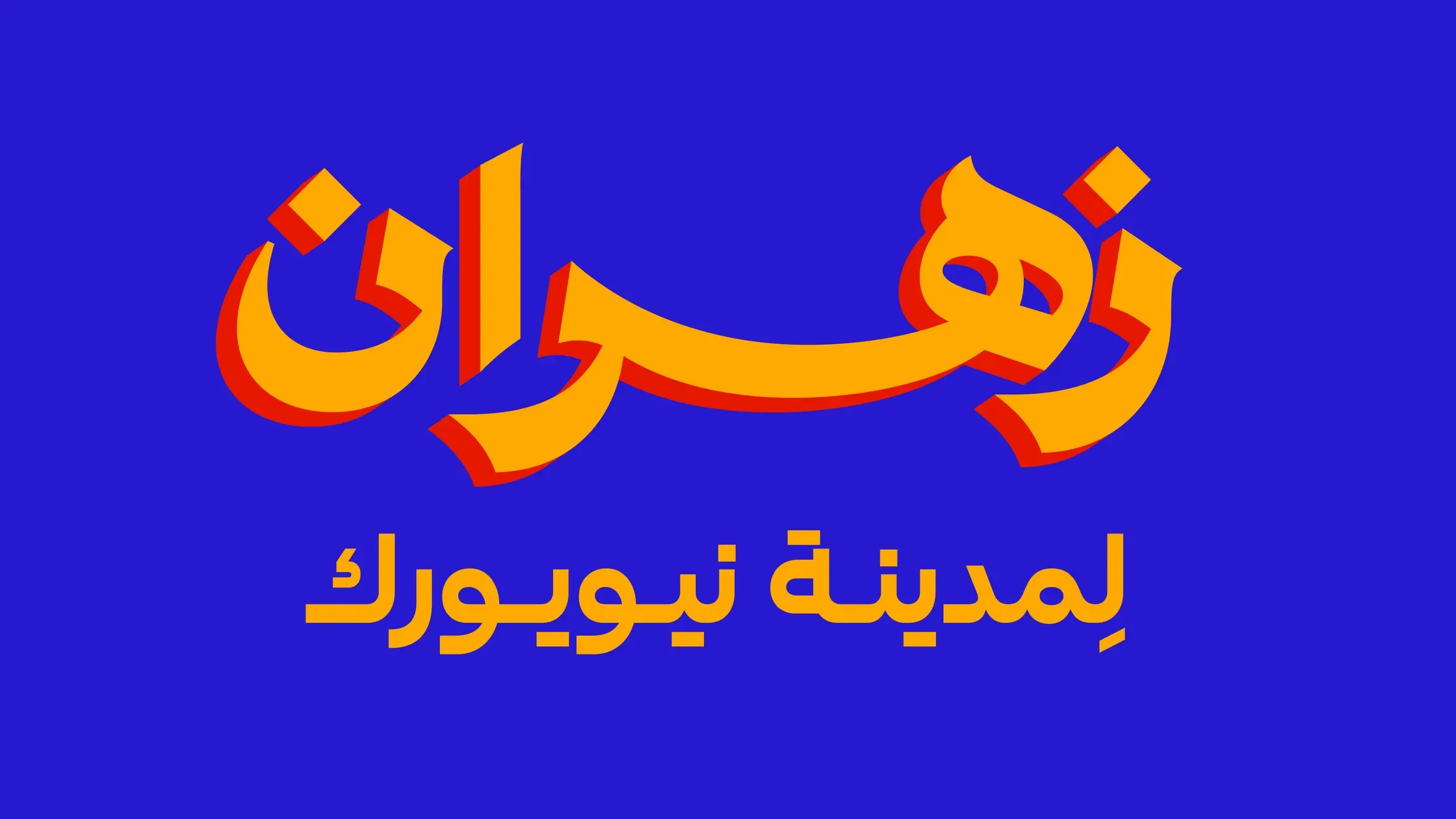
Image courtesy of Wael Morcos
Arabic typography has always been political. Now, from campaign trails to museum walls, a Brooklyn designer is pushing the script into its next chapter
In the spring of 1892, in a tiny corner of Washington Street in lower Manhattan, Syrian brothers Ibrahim and Najib Arbeely published the first edition of Kawkab Amirka (Star of America), the first Arabic-language newspaper in the United States. The Arbeely brothers chose Little Syria, a Levantine immigrant enclave, as the site for their project. Typeset entirely by hand and originally bilingual, the newspaper was a technological feat, and the brothers became masters of the craft.
A few miles over and a century later, Lebanese-American Wael Morcos runs his design and typography studio “Morcos Key” in Brooklyn, drawing from the same love of Arabic print as the Arbeelys. Working with co-designer Jonathan Key, Morcos has designed for clients hailing from Qatar to Queens. He’s designed Arabic logos for The Met, MoMA, Nike, and even did the Arabic branding for Zohran Mamdani’s campaign for mayor.
Most recently, Morcos designed the graphic identity for the New York Public Library’s first exhibit on the MENA community: "Niyū Yūrk: Middle Eastern and North African Lives in the City." Tunisian curator Hiba Abid crafted a show that maps a history most New Yorkers have never heard of: Yemeni bodegas in Brooklyn, Arab nightclubs on Eighth Avenue, and early immigrant printing presses.
—————
Read the full article at GQ Middle East.